Over the holiday I was gifted my first Winsor & Newton gouache set and I’ve been waiting for the right time to crack it open and see how it compares to some of my other gouache paints. I’ve only heard good things about these paints and I’ve never been able to get my hands on it until now, so unpacking and playing with each color was truly a treat. This post shares what I see as I soak in the first time.
I usually like to read a review or two before purchasing a product, especially if the price is a little higher like this set. So this isn’t a formal review or anything, just me sharing what I’m testing to help inform your own decision making. Individual tubes range between ~$7-11 each and this entire set is ~$64 on Amazon so seeing real photos are extremely helpful to me personally as an artist. I hope for someone else too.
Color accuracy note: These photos are not filtered or edited. I took them next to a window with natural light. I did notice a color brightness and vibrancy increased slightly on camera but in general, these feel true to what I’m seeing in person.

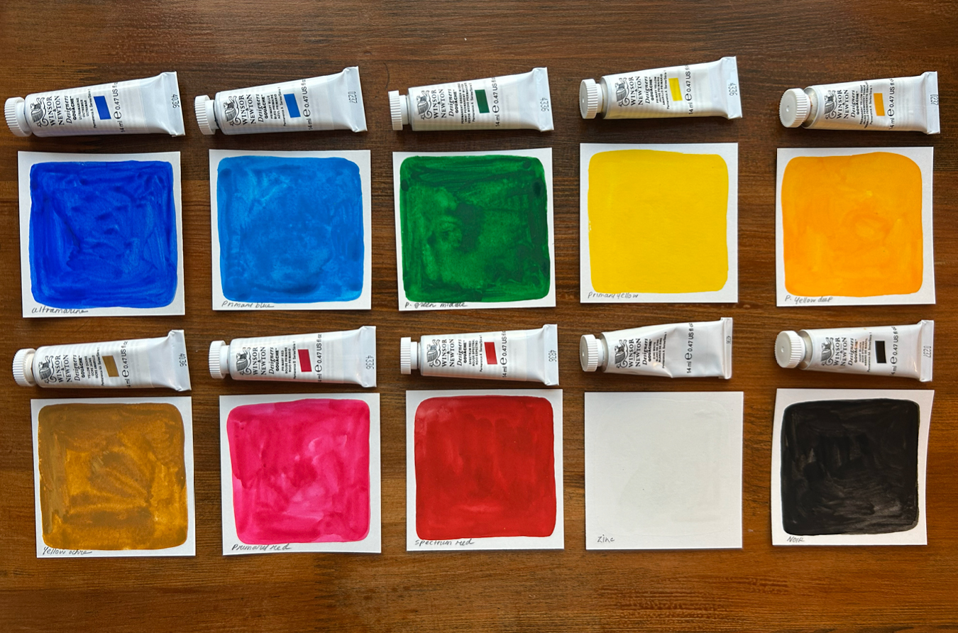
The exact set I’m sharing here is the Winsor & Newton Designers’ Gouache Introductory 10-Tube Set which includes these tubes:
- Ultramarine
- Primary Blue
- Permanent Green Middle
- Primary Yellow
- Permanent Yellow Deep
- Yellow Ochre
- Primary Red
- Spectrum Red
- Zinc White
- Ivory Black
There is a smaller 6-tube set of this line not to be confused with the 10-tube set I’m sharing today. The smaller is labeled as “Primary Colors” and only includes these tubes if you’re curious: Primary Blue, Permanent Green Middle, Primary Yellow, Primary Red, Zinc White, and Ivory Black.
For these swatches, I painted one XL swatch to feel out the richness of the pigment, and then I tested a few smaller swatches diluted with different amounts of water below it. For these demonstrations, I wasn’t technical, just quickly painting to get a good general feel of color, consistency, and quality.
I will say right off the bat – these paints are gorgeous. They are vibrant, rich, opaque, and this beautiful matte finish. The more surprising perk is they’re gorgeous in person and on the camera! Also, a little pigment goes a long way. You don’t need much to get high coverage.
Below are all ten colors with my initial thoughts, colors notes and photos. I also included links to the individual tubes since I plan on buying bigger tubes of certain colors at some point.
Ultramarine
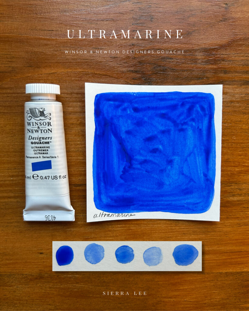
This color is STUNNING. It quite literally took my breath away. All of the colors in this set are worth it in my opinion but there are 3 or so that immediately wow-ed me purely from shock of how bright, concentrated, and little you need to achieve these color results.
This color reminds me of…Indigo, Azorean Blue, Cornflower, natural dye fabric
Primary Blue
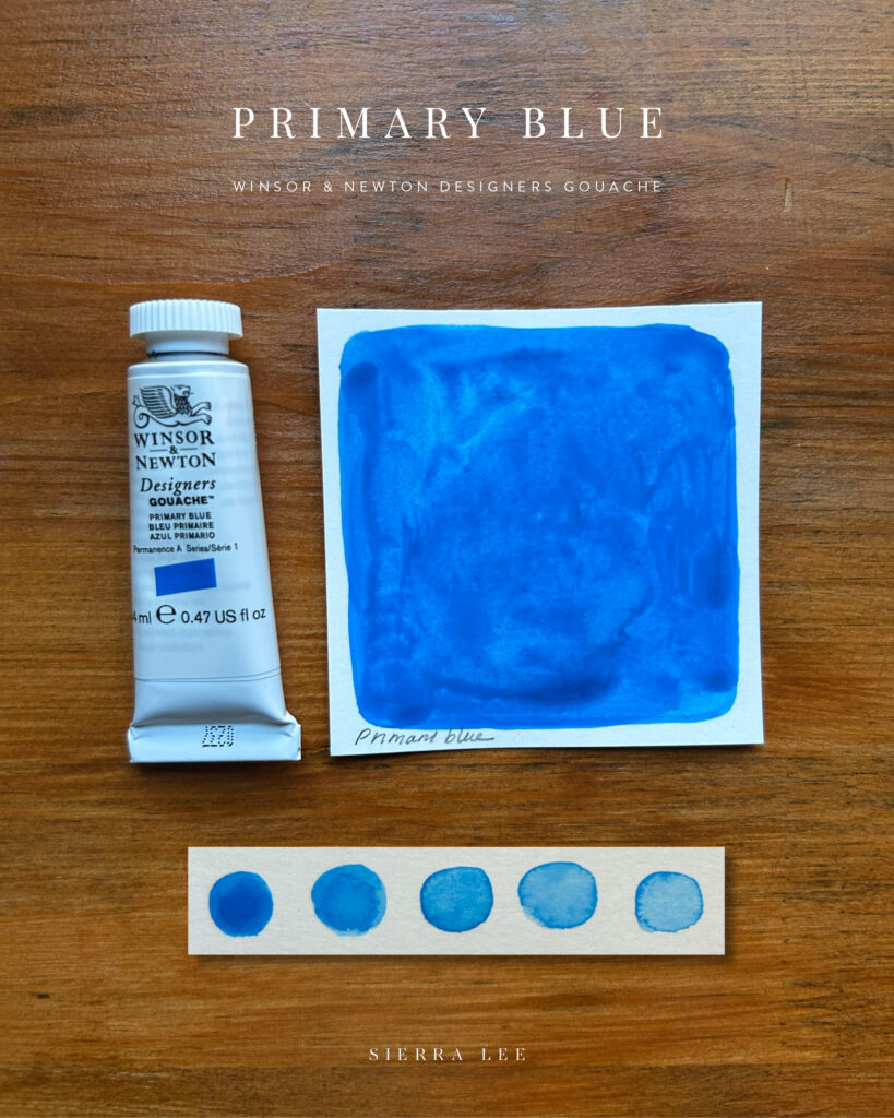
This is such a pure and beautiful shade of blue. It’s warmer and lighter than Ultramarine.
This color reminds me of…Greece, Dark Cyan, poolside lounge cushion
Permanent Green Middle
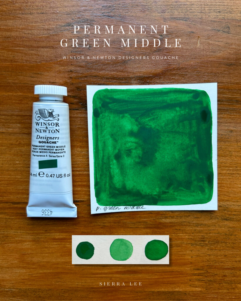
Green is one of my favorite colors.
This color reminds me of…Emerald, British Racing Green, Highlands, Mardi Gras Green
Primary Yellow
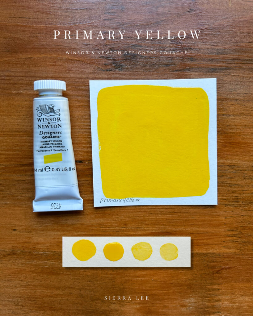
This color reminds me of…Pure Sunshine, Lemon, PEEPS
Permanent Yellow Deep
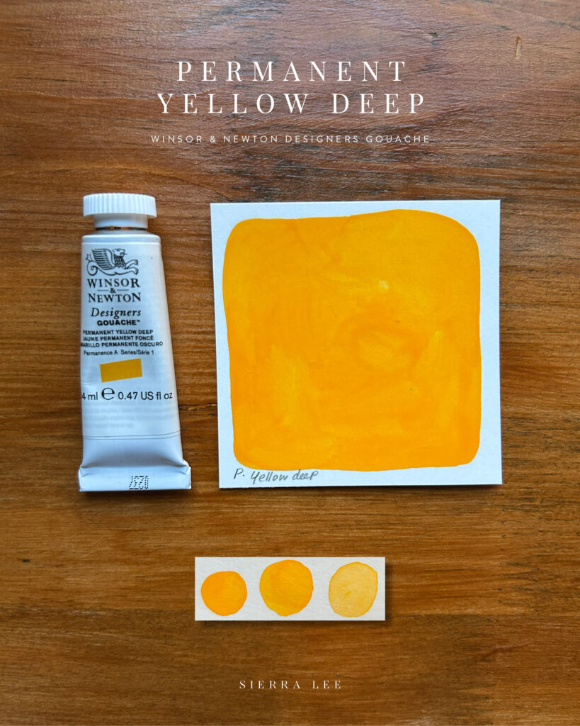
This color reminds me of…Egg Yolk, Cheddar or Macaroni
Yellow Ochre
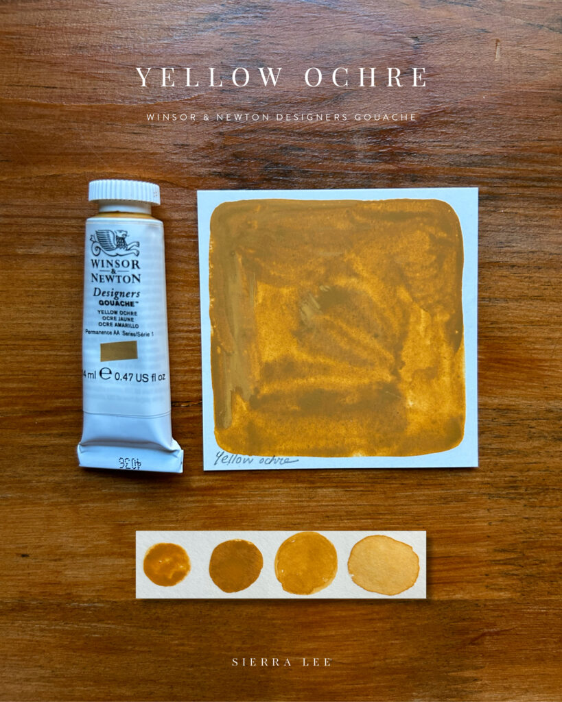
The tones that come from this pigment are absolutely gorgeous. There is no metallic or shimmer but when dried it almost create that illustration.
This color reminds me of…Vintage Gold, Beer & Spirits Mustard
Primary Red
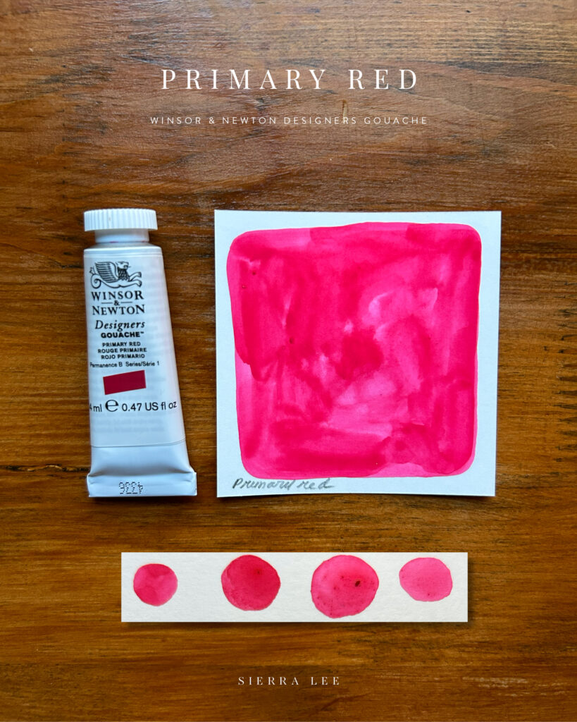
This color shocked me in a good way. To me, it leans more pink and kind of has a fluorescent look. It’s extremely vibrant. The beauty of a swatch like this is it’s not the first color that came to mind that I would pick to work with, but it’s certainly one I want to play with more, and explore other high contrast colors from this brand.
This color reminds me of…Hot Pink, Magenta, Dragon Fruit
Spectrum Red
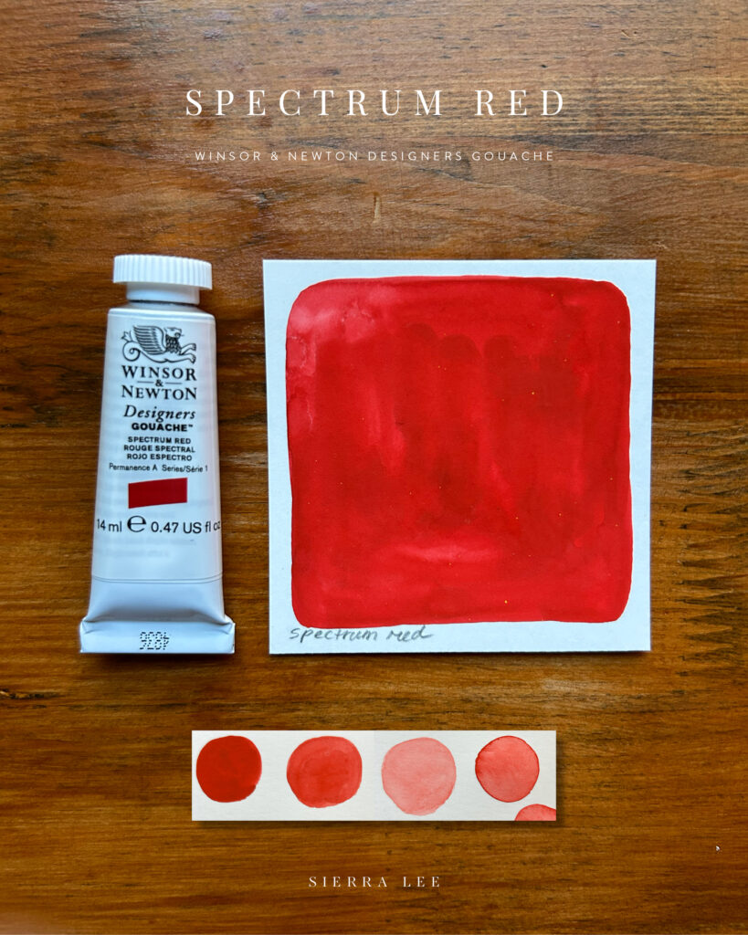
I love a bold red and this shade is just that!
This color reminds me of…Fire Hydrant, Poppy, Barn Red
Zinc White
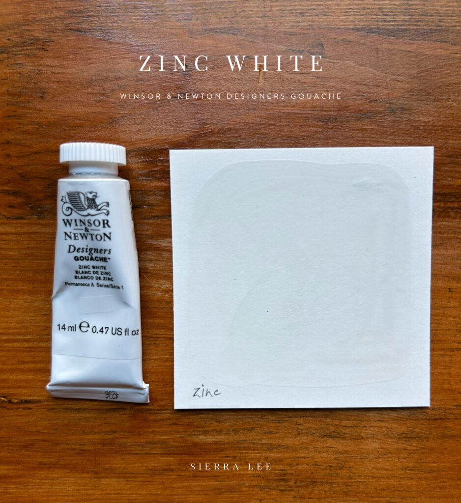
OK…so white is a very personal thing. You might have an opinion or not, but for me, white is very important. I don’t like unfinished white areas that rely on the paper to do the work and I certainly don’t love a stark, sterile white. I usually lean more towards off-white or eggshell and this pigment really surprised me in all the best ways. After a closer look, while it’s an understated color (or absence of),the beauty of how this dried is at bird’s eye view the color is almost invisibly white but when angled with natural light, the color and tone shift towards a warm subtle white-gray. I’m really excited to experiment color-mixing with this and am so happy to see that the finish still lets texture of the paint pop through.
This color reminds me of…Soft Chalk, Plaster, Warm Milk
Ivory Black
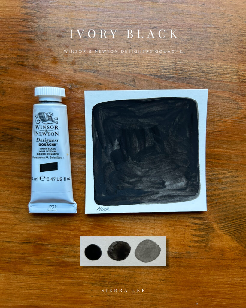
Again, the matte finish on these paints truly make it all worth it. I love that when dry I can see the undertone of the paper in some spots, enhancing more of the natural gray tones in this pigment. I feel the same way about black as I do white – I usually prefer an off-black instead of stark 100% black which this does.
This color reminds me of…Ash or Charcoal
And that’s all ten! I’m really excited to begin playing with these. I started color-mixing this to see how many different colors/shades I could get and was already doing a happy dance with how exciting some of the colors were turning out.
I’d love to know…if you use Winsor & Newton Gouache paints…what are your must-have colors/tubes? Which one(s) do you love the most and why? Do you recommend I try out a specific color next?
I have a goal to pay better attention to what I like using more of in my work, particularly colors, so if you have any recommendations, please drop a note below, I’d love to hear about it. And of course, questions are welcome, too!

Leave a Reply